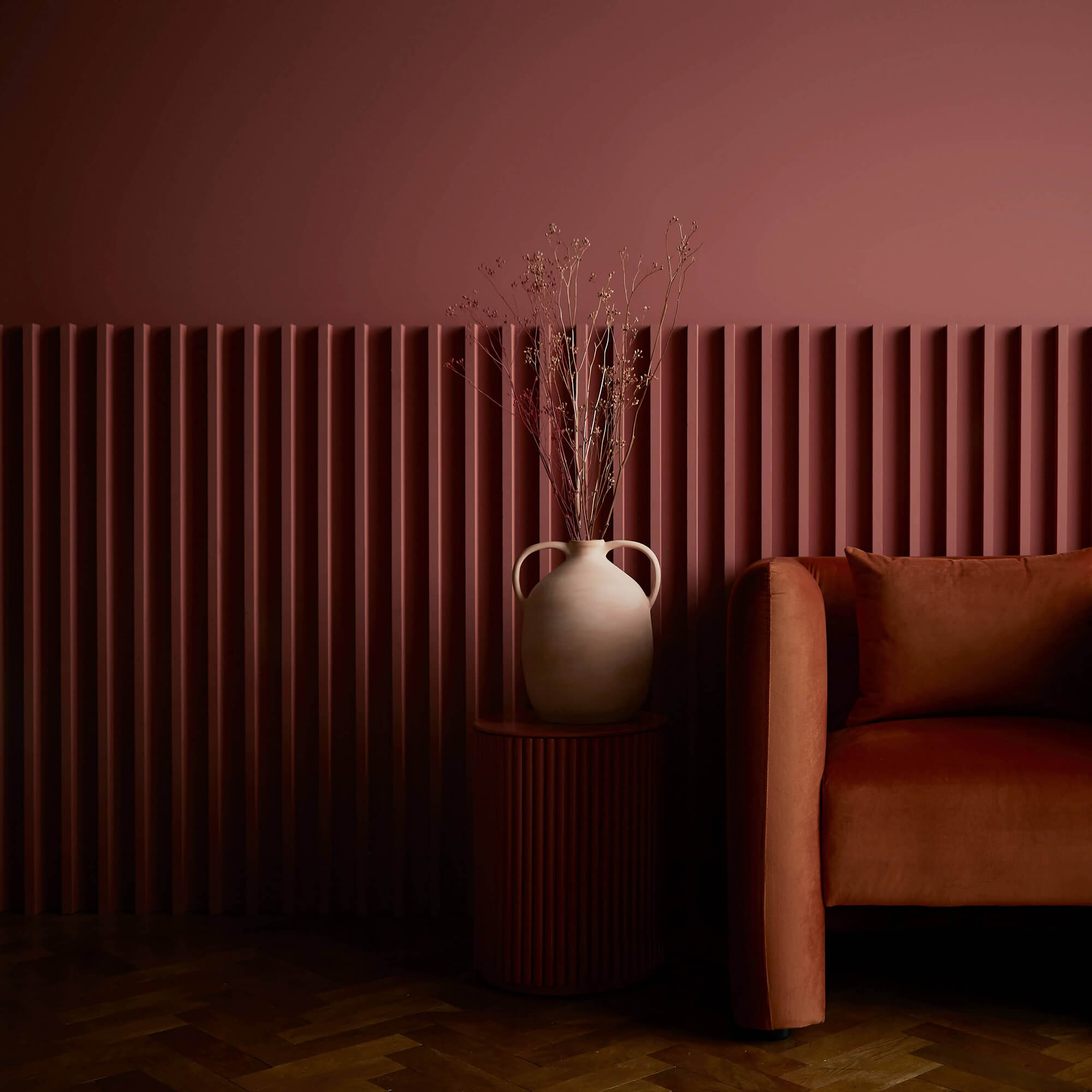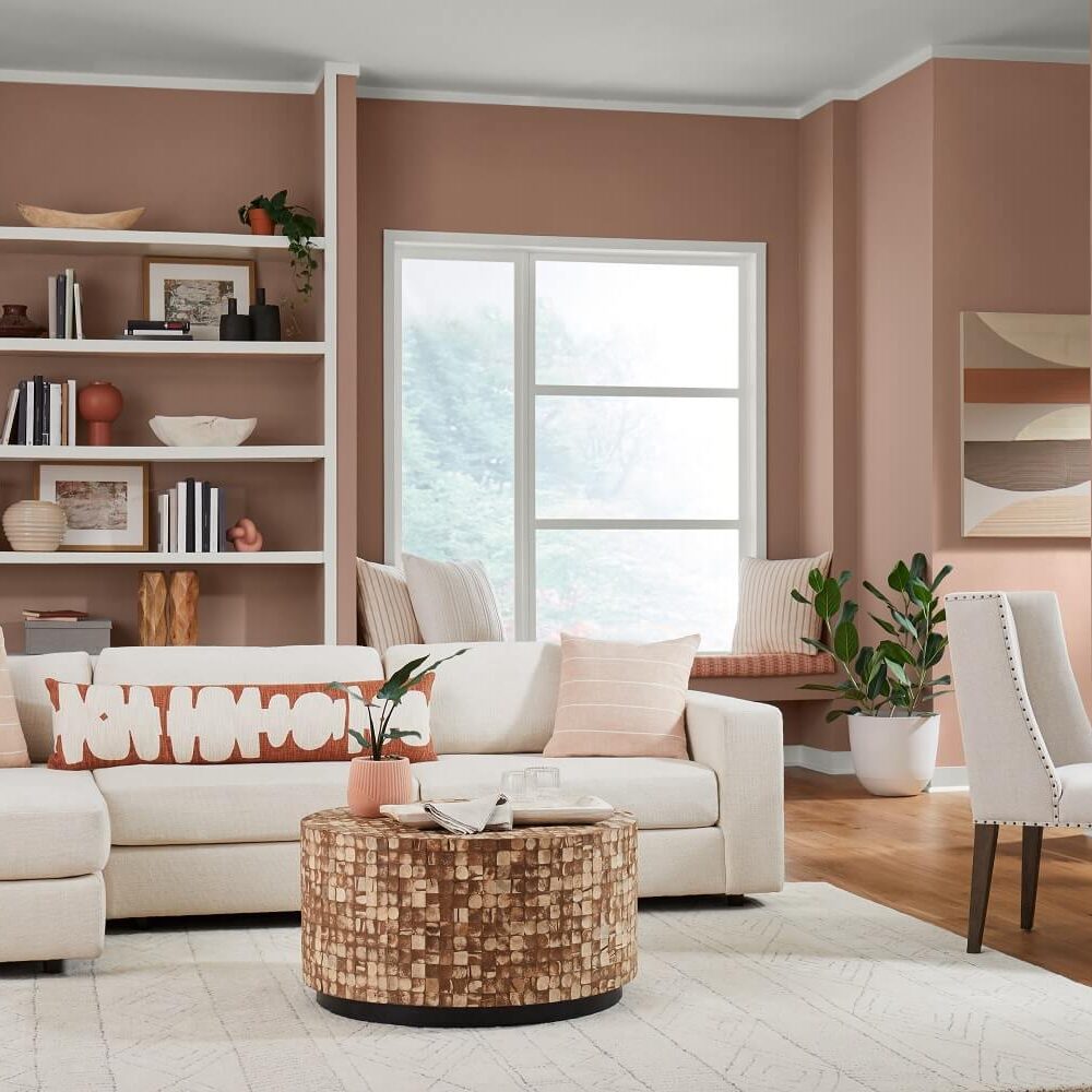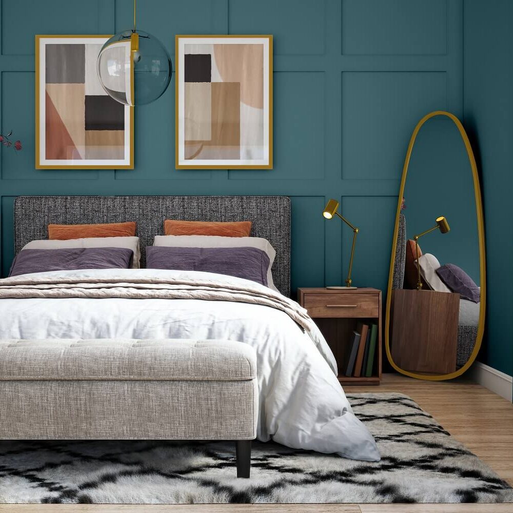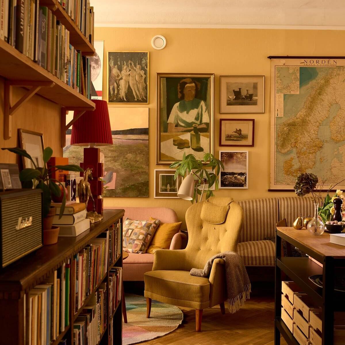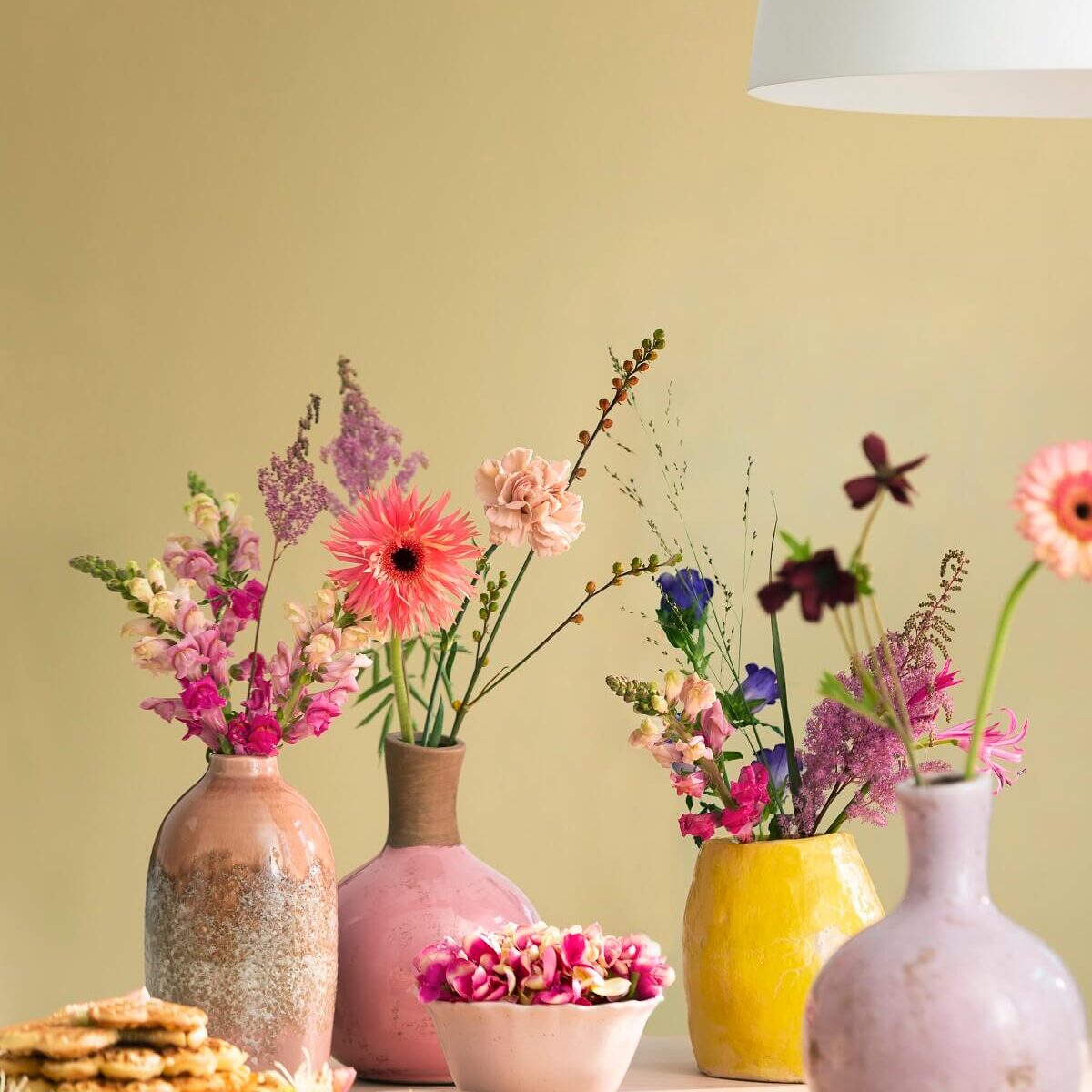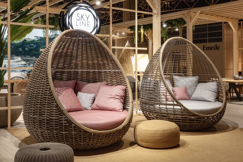
Colour trends for 2023 are mainly rich and warm neutral hues
Rich and warm neutral hues have been popular in recent years due to their versatility and ability to create a sense of comfort and warmth in living spaces. These colours are often associated with nature and earthy tones, which can help to create a calming and grounding effect in interior design.
Additionally, neutral colours such as beige, taupe, and gray can serve as a backdrop for more bold and expressive accents and accessories, allowing for greater flexibility in decor choices. Rich, warm tones like rust, mustard, and terracotta can also add depth and interest to a room without overwhelming the space.
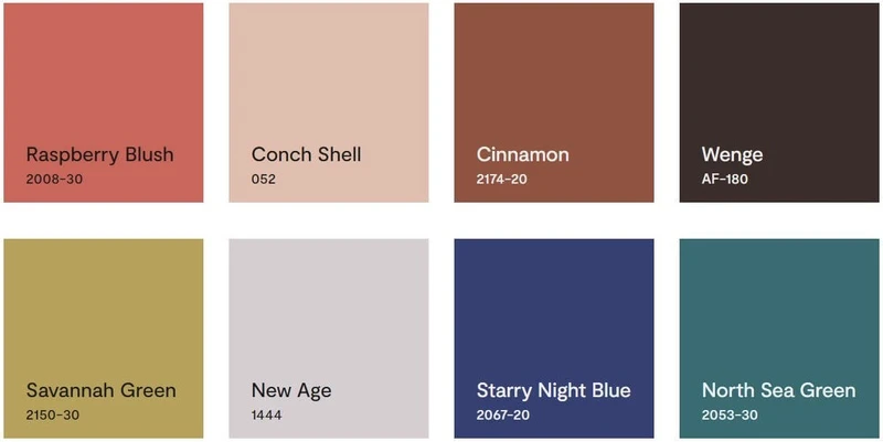
Here are colours of the year 2023 chosen by colour experts and leading paint brands in the World :
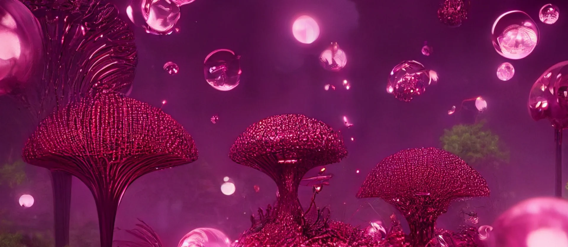
Pantone has chosen Viva Magenta as their colour of the year 2023
Typically, Pantone’s Colour of the Year selection is based on a variety of factors, including trends in fashion, art, design, and popular culture, as well as the emotional and psychological impact of certain colours. Pantone usually selects a colour that they believe will capture the spirit of the times and resonate with people across different industries and cultures.
This year, Pantone decided to select Viva Magenta as their colour of the year for the following reasons:
• It’s a bold Pink shade
• It’s usually described as brave and fearless
• It’s part of the red colour family
How to use these colours?
- Mix and match: One way to use pink and red in outdoor styling is to mix and match different shades and tones of these colours. For example, you could pair a deep red rug with a hot pink throw pillow or mix pink and red flowers in a vase or planter.
- Use them as accent colours: If you’re hesitant about using these bold colours in large quantities, start small by using them as accent colours. For example, you could incorporate pink and red accents in outdoor cushions, tablecloths, or outdoor rugs.
- Create a colour scheme: If you’re going for a bold and cohesive look, consider creating a colour scheme around pink and red. This could involve using complementary colours like green or blue to balance out the boldness of the pink and red.
- Experiment with textures and patterns: Pink and red can be used in a variety of textures and patterns, from bold stripes to soft floral prints. Experiment with different textures and patterns to create a playful and fun outdoor space.
- Use outdoor lighting: Lighting can be a great way to incorporate pink and red into your outdoor space. For example, you could use pink or red lanterns or string lights to create a festive and fun atmosphere.
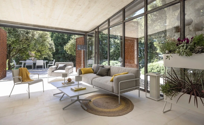
These colours in outdoor furniture styling
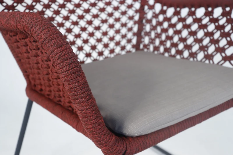
There’s no right way to use the above mentioned colours in Outdoor Styling. The colours we use and how we use them differ from one person to another because it strongly reflects personalities and style. Any colour you choose can be used as a bold colour through decorative items (accessories, cushions, throws, outdoor rugs, flower pots …). Or you can go bolder and include the colour in furniture or statement wall.
