Why is the psychology of colors important in hospitality environments?
A lot of people don’t know the relation between colors and the mind, body and emotions. Unconsciously, each color affects the mood and state of mind differently. Some colors boost happiness, others give a sense of comfort. Therefore, restaurants, spas, hotels and other hospitality businesses must be very careful with the psychology of colors in their decoration.

Hospitality businesses have as purpose to offer an amazing experience for their visitors and persuade them to come again. In a restaurant, for example, the quality of food affects a lot the impression of the client in the business, but what also plays an important role is the state of mind the client is in the first place. An unpleased mood generates a negative review. And one thing is sure; businesses don’t want their customers to leave their premises disappointed or unhappy. For this reason, the interior designer chosen to plan the space of the hotel, restaurant, spa or any other hospitality business must set on the theme and the experience the place wants to convey and choose the right colors accordingly.
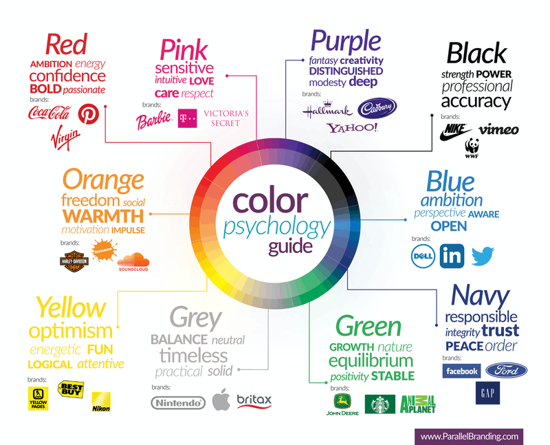
Yellow, even though it is the hardest color for the human eye to process, it promotes happiness, and is associated with warmth, optimism and cheerfulness. Yellow can also increase the metabolism and give energy. It is a smart choice to use this color in the breakfast areas in a restaurant or hotel.
Blue is the color of calm and serenity. Studies showed that this color lowers blood pressure and heart rate. It is also the most productive color. Blue is an excellent choice for offices, bedrooms or even spas to keep visitors calm and relaxed.
Red, as opposite to blue, raises the heart rate and blood pressure. This color is known to stimulate emotions and energy, and also to promote appetite making it a great choice for restaurants.
Orange, just like red, is also an appetite stimulant. This color gives a warm and fun feeling. Orange could be a perfect color to adopt for a vitrine space for its ability to grab passersby’s attention.
Green is the color of nature. It gives a feeling of serenity, tranquility and health. It is also an appropriate color for concentration and relaxation. Therefore, it can be a good choice for spas, patios and garden furniture.
Purple gives a rich, luxurious and calming feeling. It is a good choice for a lobby to keep a positive feeling about a hotel. However, this color must stay away from restaurants, as it is an appetite oppressor.
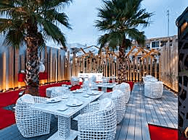
When designing, hospitality businesses must be aware that there are no standard colors for restaurants, hotels or spas. It all depends on the theme and personality to project. What should also be taken into consideration are the materials of the furniture used in a space. If a business is targeting high class society, it would be appropriate to use luxurious rattan furniture instead of plastic ones. In addition, restaurants, spas and hotels furniture must match the surrounding whether outdoor or indoor. The choice of outdoor furniture for hotels, beaches and restaurants requires knowledge in the materials to use to maintain their good shape and condition in all types of weather. Metal, aluminum and rattan outdoor furniture are the best options to equip a garden or patio.
In conclusion, knowing what each color represents before planning the hospitality spaces is very important. Using the wrong color can be determinant for the business itself, as it can affect negatively the mood of the customers, and their experience. Businesses must not neglect matching furniture with the surrounding space and using the right material for the garden furniture.


